How to Read Crypto Charts: A Beginner’s Path to Technical Analysis
Understanding how to read crypto charts is an essential skill for anyone entering the world of digital asset trading. These charts aren’t just filled with numbers and shapes — they’re real-time visualizations of trader behavior, market momentum, and price movement. With the right knowledge, a chart becomes a tool to help you make data-informed decisions rather than guesses.
This guide offers a beginner-friendly walk-through of chart types, key components, patterns, indicators, and basic strategies to help you get started with technical analysis.
What Are Crypto Charts and Why Do They Matter?
Crypto charts visually represent the price history of a cryptocurrency over time. They allow traders to interpret past behavior and anticipate future movement. Unlike fundamental analysis, which looks at external drivers like news or project updates, technical analysis focuses strictly on what the price and volume data suggest.
In a market as volatile as crypto, price action tells a lot — sometimes more than any announcement or headline. That’s why technical analysis, built on charts, plays such a central role.
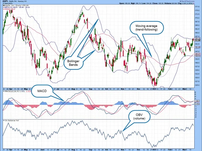
How to Read Crypto Charts: Understanding the Parts of a Crypto Chart
Credit from Bitpanda
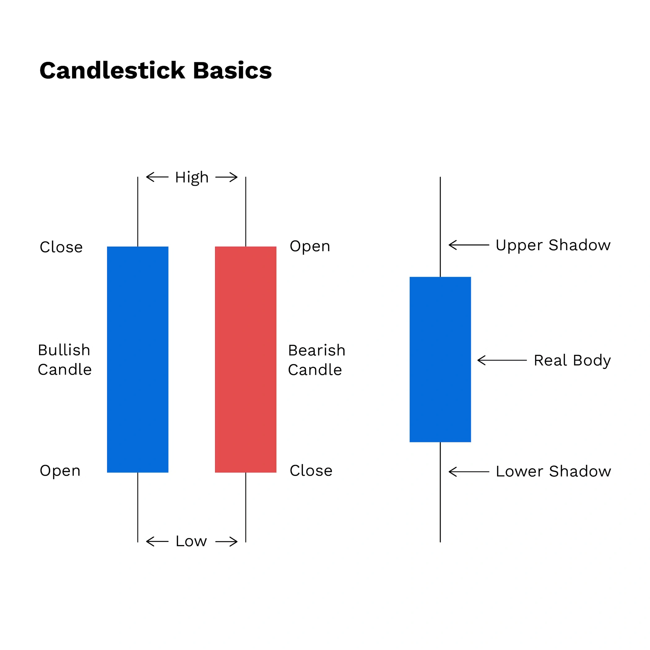
Most charts share a core set of elements, no matter which platform you use. The central feature is usually the candlestick chart. Each candlestick represents a specific timeframe and shows four key data points: the opening price, the highest and lowest prices reached, and the closing price.
The color of the candlestick indicates price direction. A green or white candle typically means the price closed higher than it opened, while a red or black candle means it closed lower. These color cues make it easier to quickly assess whether the market was bullish or bearish in that time frame.
You’ll also notice volume bars below the main chart. These represent how many units of the cryptocurrency were traded during the corresponding time period. Higher volume during price movements generally confirms stronger market conviction.
Timeframes can be customized depending on the trading style — short-term traders often focus on 1-minute to 15-minute charts, while longer-term investors may prefer daily or weekly views.
Chart Types: Choosing Your Perspective
Not all charts look the same. The simplest form is the line chart, which connects closing prices over a period. This format is useful for observing the general trend but lacks the detail needed for precise analysis.
More advanced traders often prefer candlestick charts, which reveal intra-period price movements. Each candle shows the battle between buyers and sellers in a way that a line chart can’t. Bar charts are another option, offering the same open-high-low-close (OHLC) information but in a less intuitive format.
Of these, candlestick charts remain the standard in crypto technical analysis due to their balance of detail and readability.
Candlestick Anatomy and Interpretation
Each candlestick tells a story. The body of the candle shows the range between the open and close prices. A long body suggests strong buying or selling momentum, while a short body may signal indecision. The thin lines above and below the body — known as wicks or shadows — indicate the full price range during that period.
Patterns formed by one or more candlesticks are particularly valuable. A single Hammer candle, for instance, may appear at the bottom of a downtrend and suggest a potential bullish reversal. On the flip side, a Shooting Star can mark the top of an uptrend, indicating sellers are regaining control.
Table: Common Candlestick Patterns
Credit from dYdX
| Pattern Name | Type | Signal |
|---|---|---|
| Hammer | Bullish | Potential reversal upward |
| Morning Star | Bullish | Trend change from bearish |
| Shooting Star | Bearish | Possible price decline ahead |
| Evening Star | Bearish | Reversal after uptrend |
| Doji | Neutral | Market indecision |
Patterns are more reliable when confirmed by other signals, such as volume or support/resistance levels.
Identifying Market Trends to Read Crypto Charts
Credit from Shrimpy Academy
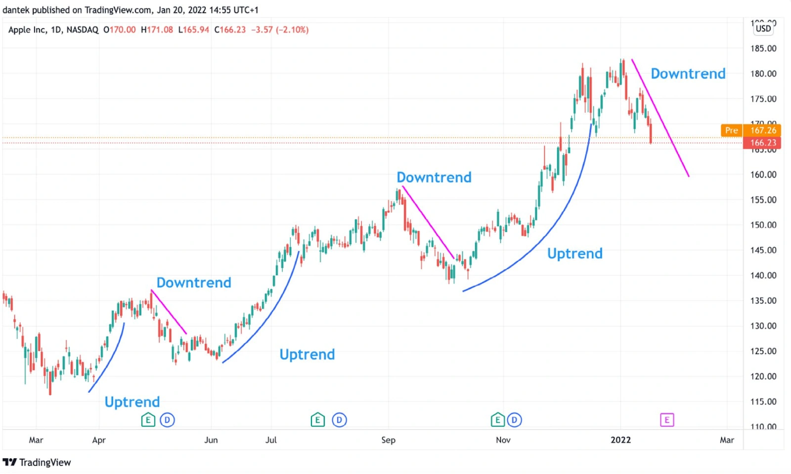
Recognizing a trend helps frame your trading decisions. When prices make higher highs and higher lows, that’s an uptrend — a sign of bullish momentum. A downtrend, by contrast, is marked by lower highs and lower lows, indicating sustained selling pressure. Sometimes, prices don’t trend at all, instead moving sideways in what’s called a consolidation range.
Traders often draw trendlines to visually track these movements. A line drawn below rising lows in an uptrend or above falling highs in a downtrend helps to clarify direction. The longer and more respected the trendline, the more meaningful it becomes.
Support and Resistance: Price Boundaries in Action
Support and resistance are horizontal levels where price tends to pause or reverse. A support level acts like a floor — if price bounces off this level repeatedly, it suggests buyers are defending it. Conversely, a resistance level acts like a ceiling where selling pressure often overwhelms buying interest.
These levels are not exact prices but zones that develop over time. Once broken, they can flip roles — previous resistance may become new support, and vice versa. Identifying these areas helps traders plan entries, exits, and stop-loss placements.
Key Technical Indicators to Know
Credit from Britannica
Technical indicators use mathematical formulas applied to price and volume data. While they should not be relied on alone, they’re useful for gauging market strength, momentum, or volatility.
The Moving Average (MA) is among the most used. It smooths out price data to reveal the underlying trend. For instance, a 50-day MA is the average closing price over the past 50 days. If price consistently stays above the MA, the asset may be in an uptrend.
Another widely-used tool is the Relative Strength Index (RSI). It ranges from 0 to 100. A value over 70 typically signals the asset is overbought, while under 30 suggests it’s oversold.
The MACD (Moving Average Convergence Divergence) helps spot changes in momentum. It tracks the relationship between two moving averages and includes a signal line and a histogram to visualize the strength of the trend.
Chart Patterns Beyond Candlesticks
Traders also look for larger price structures. A Head and Shoulders pattern, for example, often marks a market top, while its inverse can suggest a bullish reversal. Double Tops and Double Bottoms highlight failed attempts to break beyond a certain price zone, signaling exhaustion.
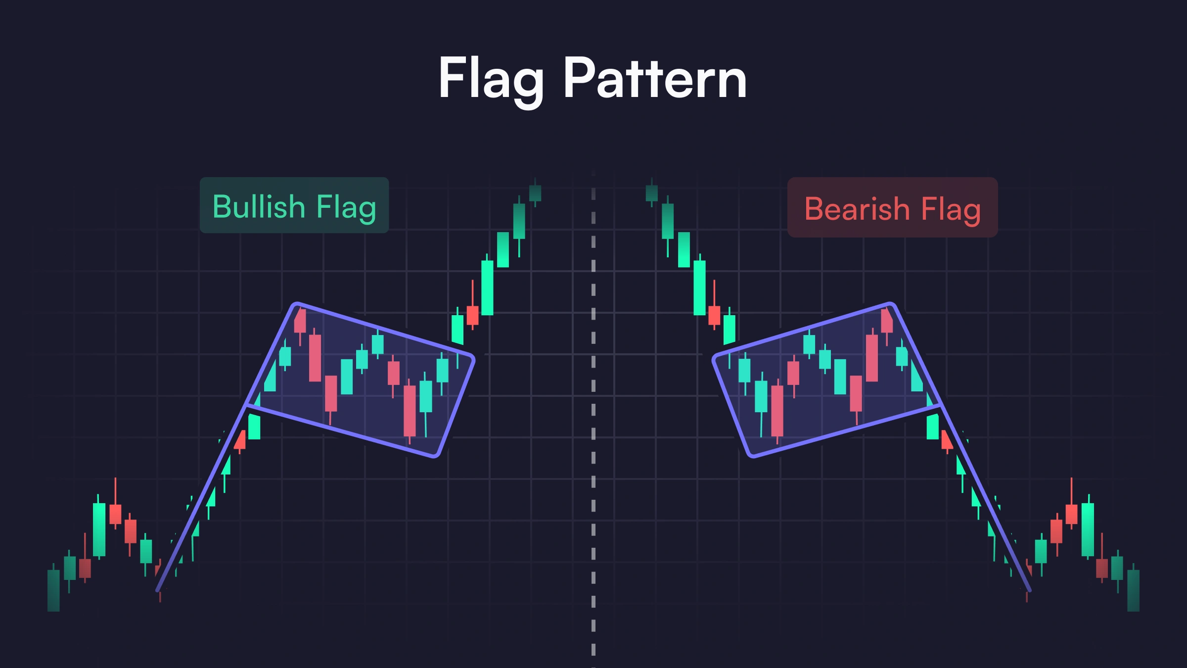
Continuation patterns like Flags, Pennants, or Triangles represent brief pauses in a trend before the asset resumes its previous direction. Recognizing these formations can help anticipate breakouts.
How Volume Enhances Your Chart Reading
Volume is a critical layer in any chart analysis. Rising prices on increasing volume indicate strong buying interest, while rising prices on declining volume may suggest a lack of conviction. Similarly, a breakout supported by high volume is more likely to succeed than one with minimal trading activity.
Volume helps filter out false signals. If price breaks a key level but volume doesn’t support the move, it may be a trap.
Setting Up Your First Crypto Chart
Credit from Finance Magnates
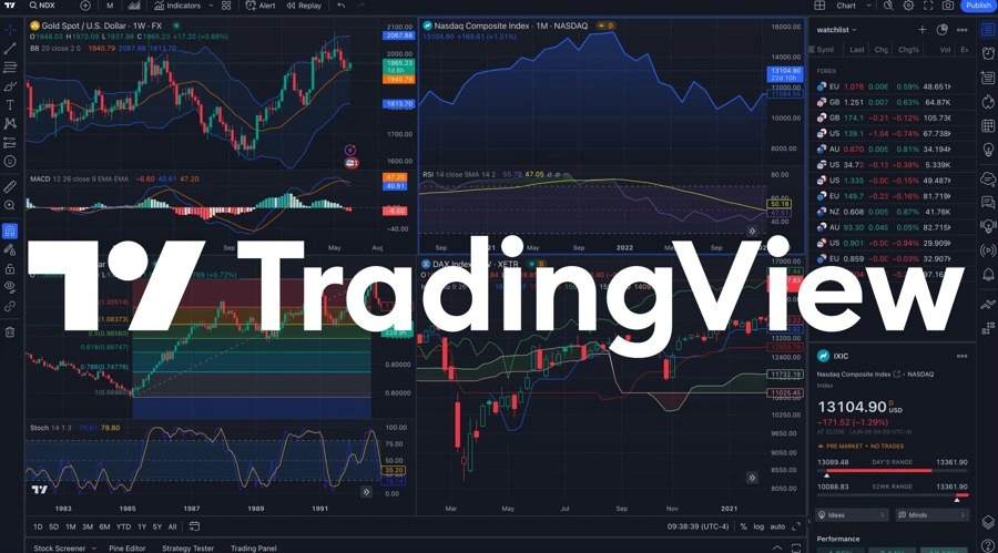
To begin, choose a charting platform like TradingView or Binance. These platforms allow you to search for crypto pairs (e.g., BTC/USDT), customize your timeframe, and apply indicators.
Start with a candlestick view, choose a daily or 4-hour timeframe, and add simple overlays like a 50-day moving average and RSI. Then, look for clear support and resistance levels based on recent highs and lows.
Even with the most basic setup, you’ll be able to start identifying trends and patterns.
How to Read Crypto Charts: Applying Simple Trading Strategies
For beginners, it’s best to keep strategies straightforward and rules-based.
A common approach is trend following — buying in an uptrend and holding until a trend reversal signal appears. Others use breakout trading, entering when price pushes through a well-established support or resistance level, ideally with high volume.
Every strategy should include a stop-loss — a predefined exit point if the trade goes against you. This helps preserve capital and manage risk.
How to Read Crypto Charts: Final Advice for New Chart Readers
Learning to read crypto charts is a process. Don’t rush it. Use demo accounts or paper trading tools to build experience. Always document your trades — noting the chart setup, rationale, and outcome helps reinforce learning.
Most importantly, don’t trade based on fear or hype. Charts reflect collective psychology. The more objectively you can read them, the more prepared you’ll be to navigate the market’s volatility.
Conclusion: Chart Mastery Begins with the Basics
Mastering how to read crypto charts begins with understanding the fundamentals — candlesticks, trends, patterns, and volume. While no chart can predict the future perfectly, they offer structure and insight in an otherwise unpredictable market.
Over time, what once looked like noise will start to form clear, repeatable signals. And with each chart you study, you’ll grow more confident in your ability to trade with purpose and precision.